Skip to content

The Success Series: Crafting a Unique Resume

Crafting a Unique Resume

Crafting a Unique Resume

In reality, crafting a unique resume that “wows” recruiters and hiring committees isn’t all about changing the font you use. First, you should determine which type of resume to go with: chronological, functional, or a combination. Next, you should select a typeface to use. Remember – you can use up to two fonts in your resume. Finally, keeping your resume to one-two pages is recommended. 

Picking a Resume Type

There are three main types of resumes: chronological, functional, and a combination of both. Surely you are likely familiar with the first one, and just may not know it yet. To explain, here are the pros and cons to each resume type:

Chronological Resume - Pros

Chronological Resume - Cons

Functional Resume - Pros

Functional Resume - Cons

Design definition displayed on an iPhone

Showcase Your Skills

Another key point is to include your professional skills early on. Additionally, if you have skills that are listed in the job description, include them. Last week, The Success Series covered how skills can surpass degrees. A point often overlooked is allowing more space for skills and a mere line for your education.

Let's Talk About Formatting

While the content of your resume is important, how you display it to appeal to recruiters is as well. To be successful, your resume needs to be readable, accessible, and able to be scanned/analyzed by applicant tracking systems or ATS.

Increase Your Interview Chances

Optimize your resume for your next interview by using Jobscan's job and resume analyzer. 

Analyze Your Resume Now

Re: A11y

A11y (accessibility) and ATS- (applicant tracking system) friendliness can make your good resume great. The content is key, sure, but if no one can read your resume, it’s likely not going to be effective at getting you hired.

ATS-Friendly Fonts

In today’s digital age, most companies use applicant tracking systems, or ATS. Thus, it’s imperative your resume is ATS-friendly. Be sure to choose fonts that are easy to read. Adopted from Jobscan’s top 10; below you’ll find some of the best ATS-friendly, professional fonts to use in your resume.

Cambria font

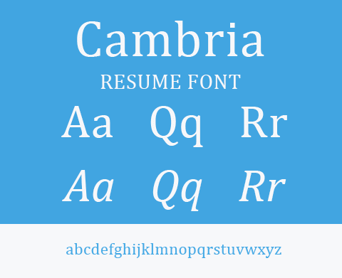
Cambria is easy to ready on screen and is ATS compatible. However, if Cambria is not available, a Google Font typeface that’s comparable is Caladea.

Georgia font

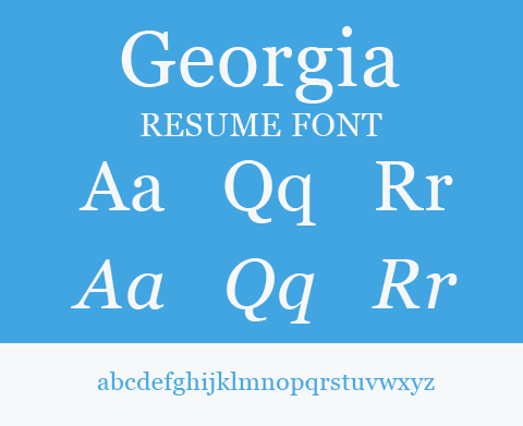
Georgia was designed for the Internet in the nineties to work on all screens and resolutions. Even now, it continues to be one of the most readable fonts.

Calibri font

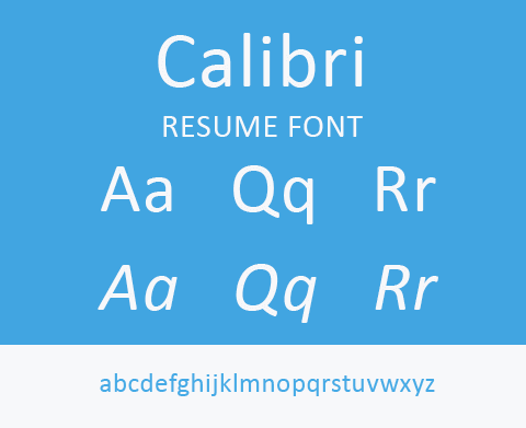
Calibri was introduced in 2007 and quickly became a common replacement for Times New Roman.

Tahoma font

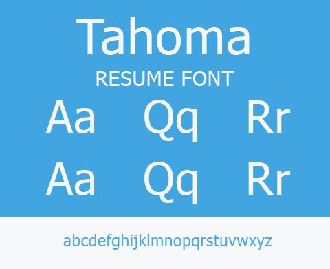
Tahoma was first introduced in Windows 95. It is a great option for engineers or developers.

Verdana font

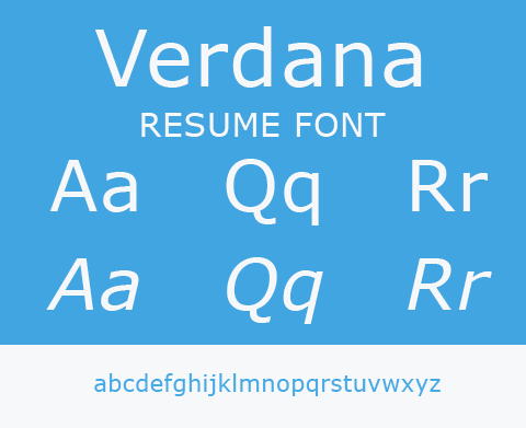
Verdana was commissioned to be legible on small screens at small resolutions.

In Conclusion

Finally, with these tips in mind, you should be well on your way to a new job. Keep an eye out for future posts about preparing for interviews, listing references, and more! If you have any comments, email us or let us know below.

Resources & Further Reading

Leave a Reply

Your email address will not be published. Required fields are marked *