Top 5 Things Designers Need to Know About Accessibility
Here are the top 5 things designers need to know about accessibility:
- Accessibility doesn’t inhibit innovation
- Don’t use color as the only visual method to convey information
- Ensure sufficient contrast between text and backgrounds
- Don’t require users to hover to find things
- Include visual indicators for keyboard focus
First, What is Accessibility?
Before we can into the nitty-gritty details of making your website accessible, we need to take a small step back. In short, accessibility refers to building applications and content that can be used by all. This includes those that have visual, motor, auditory, speech, or cognitive disabilities.
Next, Why Does it Matter to Me?
Accessibility means providing equal access and opportunity to people with disabilities as well as older people, people located in rural areas, and people in developing countries. You might not be in one of these groups, but the UN Convention on the Rights of Persons with Disabilities recognizes access to the web a basic human right. Additionally, over 56 million people in the United States alone have a disability.
Lastly, How Can I Make My Website Accessible?
Have you heard, possibly from a coworker, that making a website accessible is difficult and costly? Well, it doesn’t have to be. For instance, if you’re building a website from scratch can meet the requirements without adding extra cost or effort. On the other hand, making an inaccessible website accessible can require a much greater effort. Ultimately, if you want to see how your website performs, you can use the Accessibility Insights for Web Chrome extension.
What Does Accessibility Look Like in 2021?
Accessibility in 2021 is much different from what it was ten, let alone twenty years ago. Currently, people can use assistive technologies to browse the web, like screen readers, speech recognition software, Braille terminals, and alternative keyboards. While this definitely helps, ideally, your website should be designed with accessibility in mind. Not only does it expand your audience, but it can put you ahead of your competitors as well.
Top 5 Things Designers Should Remember
1. Accessibility does not impede or inhibit innovation.
Creating an accessible product does not mean the product has to be boring, ugly, or too cluttered. Embracing accessibility guidelines will help you to create a product for all.
2. Don't use color as the only visual means of conveying information.
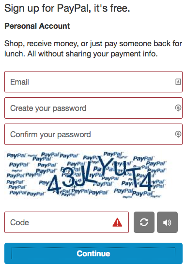
Next, you can use color to highlight or complement assets that are already visible. A great example of this is adding a red border to form elements, like you can see in this screenshot to the right. If the borders were not visible, and only grey colors would use, it would seem only one field was required – the reCAPTCHA. So, as you can see, color can really “make or break” forms.

3. Ensure sufficient contrast between text and backgrounds.
Have you ever gone to a website with a white background, and light grey text? It’s pretty hard to read, isn’t it? Well, believe it or not, the WCAG recommends the contrast ratio for text and its’ background 4.5 to 1. Ideally, if the proper ratio is used, even people with low vision will be able to read it.
4. Don't make people hover to find things.
Even though you may be able to easily hover over an element with your cursor, people using speech recognition tools cannot. Further, similar technologies rely on actionable items being visible, so items with hover elements are ignored/skipped. Instead of using onHover, consider using onClick events.
5. Include visual focus indications for keyboard focus.
Including outlines or boxes around highlighted elements, when using a keyboard to navigate, makes it much easier to tell where you are. If you do not have any indicators for keyboard focus, the person may not be able to use the site to its full extent.
In Conclusion
Ultimately, when designing a website, it’s important to remember that the web was designed to work for all individuals. For example, color blindness may seem like a trivial disability, but in reality, it affects more people than you may realize. Designing with accessibility for all in mind allows us to make information available for everyone.
Did we miss something you thought should be included? Let us know in the comments below.
Resources & Further Reading
Ellice. (2020, October 21). 10 ways to make your website accessible – DreamHost. Retrieved February 23, 2021, from https://www.dreamhost.com/blog/make-your-website-accessible/
Hausler, J. (2015, December 18). 7 things every designer needs to know about accessibility. Retrieved February 23, 2021, from https://medium.com/salesforce-ux/7-things-every-designer-needs-to-know-about-accessibility-64f105f0881b
Henry, S. L., & McGee, L. (Eds.). (2018). W3c. Retrieved February 23, 2021, from https://www.w3.org/standards/webdesign/accessibility
Stanley, P. (2018, June 29). Designing for accessibility is not that hard. Retrieved February 23, 2021, from https://uxdesign.cc/designing-for-accessibility-is-not-that-hard-c04cc4779d94
