
What is a CTA?
A Call to Action, or CTA, is a phrase or a couple words like, “Buy Now” that tell the user exactly what action to take and how to take it. CTAs usually have a clickable button or hyperlink that takes the customer to a different part of the website.
The “action” part of a CTA can literally be almost anything from get a coupon, attend an event, to sign up for a webinar. CTAs don’t have to only be on websites, either. They can be featured in an ebook, an online review or post, in an email, or at the end of a blog post. There are several crucial elements that should be included in the CTA to ensure its success.
AdEspresso by Hootsuite
50 Call To Action Examples (and How to Write the Perfect CTA)
Want more email subscribers? Contest entries? Conversions? You won't get them without the right call to action.
Learn MoreWhy CTAs Are Important
Lots of companies and businesses put a “Sign Up” or “Register Now” button in an ad. They spend the majority of their time, energy, and money into their advertisement – including social media, blog, and email marketing – and they fail to bring in new customers. Just creating a button with a concise phrase or action on it won’t be enough to entice people to click it. Adding a stock photo of a beach when advertising rental properties may be eye-catching, but if you are advertising rentals in the north, a different image, like a snow alp, might be better.
When paired with A/B testing, you can discover a wealth of information about your customers, potential leads, and website visitors, as well as which variant performs best. You can then make small adjustments, re-test, and find that perfect placement that leads to the best click-through rate.
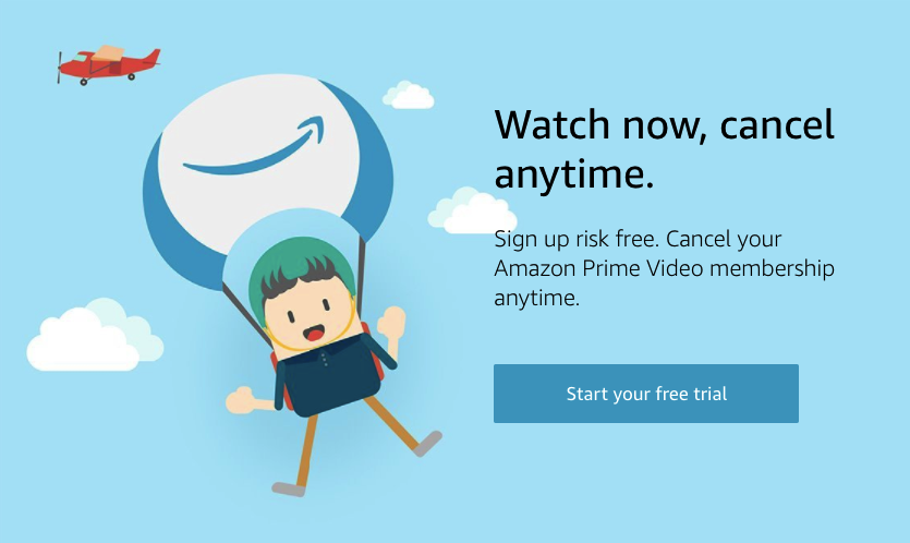
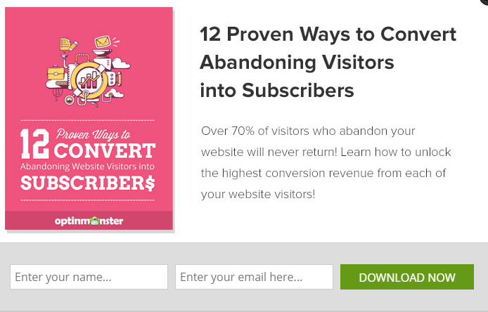
Effective CTA Examples
Some of the best CTAs speak directly to the user and use specific words or phrasing to direct them to the desired outcome, such as: Discover your best life, Join our community, Book your next adventure, etc.

Utilizing emotional trigger words and time-specific actions in your CTAs can increase the conversion rates and click-through rates just by switching the button color. In fact, SAP found that orange CTAs boosted their conversion rate over 32.5%, and Performable (a marketing agency acquired in 2011 by HubSpot) found that red CTAs boosted their conversion rate by 21%.
CTA Checklist
HubSpot created this checklist of the essential elements needed for creating an effective CTA. To save you time and energy, try to keep these in mind.
To get someone to click on your CTA, they have to be able to notice it. The colors used in your CTA should contrast with those used on your website. They should be large enough to be noticed but not too large that they cover most of the screen real estate.
Using “Submit” as the copy on your CTA isn’t likely going to inspire much action. Try using a short, jargon- and acronym-free phrase that uses actionable verbs.
People should know what is going to happen when they click on a CTA. Are they registering for a demo, signing up for a newsletter, or downloading a free resource? Be sure to explicitly state what they’re getting into when they click that button.
A CTA is the most effective if people are taken to a dedicated landing page, rather than a random page, on your website. If you are trying to get customers or leads to contact you, your contact CTA should say something like “Contact Us Now” or “Reach Out to Us”, and point to the Contact page where they can submit their information.
Conclusion & Free Downloads
Now that you’ve learned what a CTA is, how to create an effective one, and where it should take users, it’s time to put your skills to the test! If you need a good starting point, download the PowerPoint file below to see 28 different examples.
Download Free CTA Templates
Click the icon above to access 28 CTA templates created in PowerPoint by HubSpot.
Resources & Further Reading
- Gotter, A. (2020, May 19). 50 Call To Action Examples (and How to Write the Perfect CTA). Retrieved August 29, 2020, from https://adespresso.com/blog/call-to-action-examples/
- Mineo, G. (2017). What Is a Call-to-Action? [FAQs]. Retrieved August 29, 2020, from https://blog.hubspot.com/marketing/what-is-call-to-action-faqs-ht
- Wilton, A. (2020, February 13). 2019 CTA Statistics that Prove the Power of Call-to-Action Buttons. Retrieved August 29, 2020, from https://www.protocol80.com/blog/2019-cta-statistics
- Zheng, D. (2020, May 15). 21 Call to Action Examples in Writing and 3 Rules for Effective CTAs. Retrieved August 29, 2020, from https://www.crazyegg.com/blog/call-to-action-examples/